Learning Curve
This topic might seem familiar, since we have already plotted learning curve. This was done during the Optimization and Regularization lesson using a code:
plt.plot(range(n_epochs), cost_history)
plt.suptitle("Cost over epochs")
plt.xlabel("Epoch #")
plt.ylabel("MSE Cost")
With an output of:
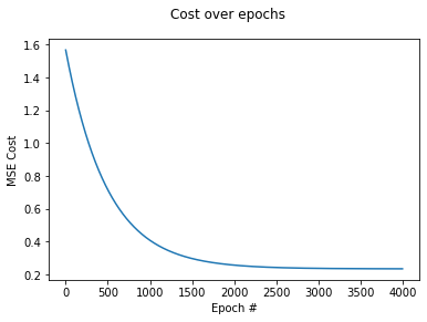
Let's revisit this topic before jumping into polynomial features and overfitting. The graph above contains only a single curve. This is our training loss/cost, since the cost_history includes the MSE cost of our training data.
Why do we create such a plots? The plot above is simply for visualizing the concept. Linear models that have been implemented in Scikit Learn have an early stopping option activated by default. This will stop the training process if the error hasn't changed in n_stops. Having that said, it does help understanding the process when you see the visual representation, doesn't it?
Jump into the Jupyter Notebook and take a loot at how we can create two plots that might be handy in various learning situations:
- Training Size vs Score.
- Epoch vs Score.
The score we will be using is accuracy, but feel free to play around with the Notebook. Maybe swap accuracy to recall and precision? There's a trade-off between these two, as we've learned before.