Polynomial Features
On the Notebook "Optimization and regularization", we were trying to predict a house price. A fairly well performing line was this:
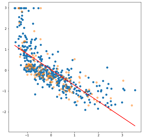
- x-axis is the LSTAT feature (% lower status of the population)
- y-axis is the median price in dollars.
- …both have been StandardScaled.
The orange samples are the chosen testing set, the blue dots are the training set. Would you agree that various different train/test set splits would always have a high error? A straight line doesn't seem to fit the samples very well. In real-life data, the input features tends to be nonlinear.
Food for thought: The housing prices seem to be capped. If you check the original values before applying the standard scaling, you will notice that there are 16 houses that have the price of exactly 50k dollars. This means that our ground-truth, y, holds values that are most likely not correct. How would you fix this?
Recap: The Elements of Linear Regression
In order to fully understand this lesson, you need to remember how linear regression functions. As a reminder, for a single feature (univariate regression), we will fit a line:
$ y = b + wx $
For multiple features (multivariate regression), we need n amount of weights. The equation is:
$ y = b + w1x1 + w2b2 + \cdots + wnxn $
Remember that the bias term can be included into each x-vector in the matrix X. By convention, the bias term is placed as the first element. Thus, the leftmost column is full of ones. Below is a visual representation of X that has n features (incl. bias) and m samples.
$ X =\begin{bmatrix} 1 & x{11} & x{21} & \cdots & x{n1}\ 1 & x{12} & x{22} & \cdots & x{n2}\ 1 & x{13} & x{23} & \cdots & x{n3}\ \vdots & \vdots & \vdots & \vdots & \vdots \ 1 & x{1m} & x{2m} & \cdots & x{nm}\ \end{bmatrix} $
Previously, we have used the normal equation "to minimize the residual sum of squares between the observed targets in the dataset, and the targets predicted by the linear approximation.", as Scikit Learn documentation states in LinearRegression's docs. The equation for this normal is:
$ \theta = (X^T \cdot X)^{-1} \cdot X^T \cdot y $
Introducing Polynomial Features
The formula above contains no exponents. All variables are linear and we are simply performing dot products. The same applies to the logistic regression (classifier): the features are linear as well as the cost function; the only logistic part of that model is the sigmoid function.
Polynomial features might feel a bit counter-intuitive, but we can use the linear regression to plot a curve. The concept is surprisingly simple. The only change needed is adding new features to our X. There new features are polynomial degrees of our existing features.
Let's create a dataset X with 2 features.
# Let our X be of shape (10, 2).
X = np.array(range(20)).reshape(-1, 2)

# Give our make-believe features some names.
col_names = ["a", "b"]

df = pd.DataFrame(X, columns=col_names)
The index column (typical RangeIndex) is not shown in the table below for readability reasons. Other than that, the df consists of:
| a | b | | :--: | :--: | | 0 | 1 | | 2 | 3 | | … | … | | 18 | 19 |
Now, let's add some more features. Using the 3rd polynomial degree, let's create a poly_X using the Scikit Learn's PolynomialFeatures. Notice the constructor parameter interaction_only=False.
# Set the wanted polynomial degree
degree = 3

# Construct the PolynomialFeatures.
poly = PolynomialFeatures(degree, include_bias=True)

# Fit the data
X_poly = poly.fit_transform(X)

# Get the new columns names, based on the original names ["a", "b"]
generated_col_names = poly.get_feature_names(col_names)

df_cubic = pd.DataFrame(X_poly, columns=generated_col_names)
The df_cubic contains…:
| 1 | a | b | a^2 | a b | b^2 | a^3 | a^2 b | a b^2 | b^3 | | :--: | :--: | :--: | :---: | :---: | :---: | :----: | :----: | :----: | :----: | | 1.0 | 0.0 | 1.0 | 0.0 | 0.0 | 1.0 | 0.0 | 0.0 | 0.0 | 1.0 | | 1.0 | 2.0 | 3.0 | 4.0 | 6.0 | 9.0 | 8.0 | 12.0 | 18.0 | 27.0 | | 1.0 | 4.0 | 5.0 | 16.0 | 20.0 | 25.0 | 64.0 | 80.0 | 100.0 | 125.0 | | … | … | … | … | … | … | … | … | … | … | | 1.0 | 18.0 | 19.0 | 324.0 | 342.0 | 361.0 | 5832.0 | 6156.0 | 6498.0 | 6859.0 |
The include_bias parameter should be fairly obvious when you look at the table above. It added the bias term as the left-most column into our poly_X. Scikit Learn usually adds this for you, so you can usually use the include_bias=False. The other parameter, interaction_only, is easier to understand if we print the df_cubic with True value. This time, the poly is constructed using: poly = PolynomialFeatures(degree, interaction_only=True, include_bias=False)
Notice that we are not simply adding the polynomial terms a**2, a**3, b**2 and b**3. We are also adding a**2 * b and b**2 * a. The 4th degree polynomial would also add e.g. a**2 * b**2 and a**3 * b. Below are the feature names created using degrees = [2, 3, 4].
# 2nd degree
['a', 'b', 'a^2', 'a b', 'b^2']

# 3rd degree
['a', 'b', 'a^2', 'a b', 'b^2', 'a^3', 'a^2 b', 'a b^2', 'b^3']

# 4th degree
['a', 'b', 'a^2', 'a b', 'b^2', 'a^3', 'a^2 b', 'a b^2', 'b^3', 'a^4', 'a^3 b', 'a^2 b^2', 'a b^3', 'b^4']
You have to be careful with polynomial features. If you have large number of features to start with, adding polynomials can create a surprisingly large feature space. Our MNIST example had 64 features (the pixel values of 8x8 image). If we would add 3rd degree polynomials, the resulting dataset would have almost 50000 features. With 4th degree, the size would scale up to over 800k.
Notice that you can add similar features fairly easily yourself, especially if the original dataset is a Pandas DataFrame. Our original df DataFrame had only two columns: a and b. Running the code below would add the 2nd degree polynomials:
df.loc[:, "a^2"] = df["a"] ** 2
df.loc[:, "b^2"] = df["b"] ** 2
df.loc[:, "a*b"] = df["a"] * df["b"]
…with the outcome of….
| a | b | a^2 | b^2 | a*b | | :--: | :--: | :--: | :--: | :--: | | 0 | 1 | 0 | 1 | 0 | | 2 | 3 | 4 | 9 | 6 | | 4 | 5 | 16 | 25 | 20 | | … | … | … | … | … | | 18 | 19 | 324 | 361 | 342 |
Notice that you will most definitely want to perform the StandardScaling after this operation.
Conclusions
High dimensionality tends to increase the sparsity of datasets. Compare the 2-dimensional and 3-dimensional graphs.
The quote above is from a classification lesson where we explored how the k-NN classifier works. This phenomenon is called the curse of dimensionality, and it applies here as well. Notice that the polynomial features are feat**d times larger than the original values. Adding polynomial features shouldn't be done unless you know that there is a need for those. How would you know it? Visualization is one method for fairly small number of features. If you look at the graph at the top of this lesson, isn't it fairly obvious for a human eye that a straight line won't fit? Learning curves can reveal that your data is underfitting the data. We will discuss this topic in more depth in later lessons.
In the Jupyter Notebook exercise, you try fitting n-degree polynomials into the Boston data shown above.